Nikon Coolpix 5000 Firmware 1.7 - Update 06-OCT-2002

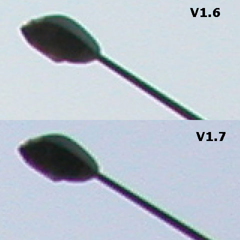
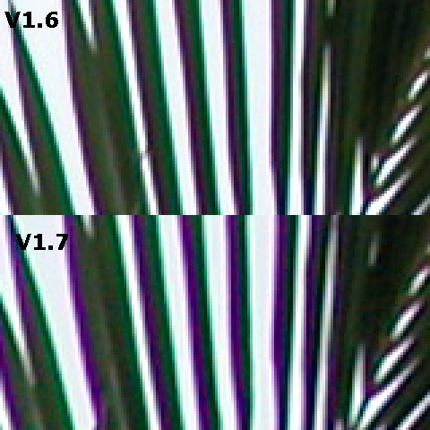
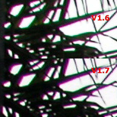
Adding to my comments on the previous page, apparently 1.7 images appear less saturated as well, although the differences are sometimes very small. Generally, less saturation is better than too much saturation which can cause information to be "clipped" like highlights. Saturation is easy to increase afterwards in the "pixelroom". Color balance of 1.7 seems to be less "yellowish" than 1.6, although it depends on the situation. Some people suggest a difference in sharpness, I only see minor differences, with 1.7 perhaps a tad more, very hard to tell. Anyway, now that we have RAW we have much more control as to how the image looks, an update about that is in the making.

 
V1.6
V1.7
V1.7 after adjustment

In this crop out of the first image on the previous page, I changed the midtone input levels from 1.00 to 1.25, increased saturation by 15% and reduced yellow midtone color balance by 10%. This makes the 1.7 image look like the 1.6 image in terms of colors and saturation, but there is a bit more noise in the shadows. Click to see the crops at 100%.
The differences between the last two images on the previous page are much smaller, with the 1.7 having a more neutral color balance.

Purple Fringing
Example 1
Purple Fringing
Example 2
Purple Fringing
Example 3

Strangely enough in the last shot of the previous page, 1.7 seems to have more chromatic aberration (purple and green fringing) overall. Possibly that is due to the fact I used two different cameras to compare 1.6 and 1.7. There could be many factors a play because the difference in example 3 is smaller than 1 and 2 (with 1.6 having more fringing, but that is due to the fact 1.7 has darker shadows and hence hides the green fringing). Click to see the 300% enlargements.

10-OCT-2002: Additional findings on next page.